Materials
Fire, Stone and Metal in Fantasy Illustration
Material cues become convincing when edge, scale, shadow and light agree about the imagined surface.
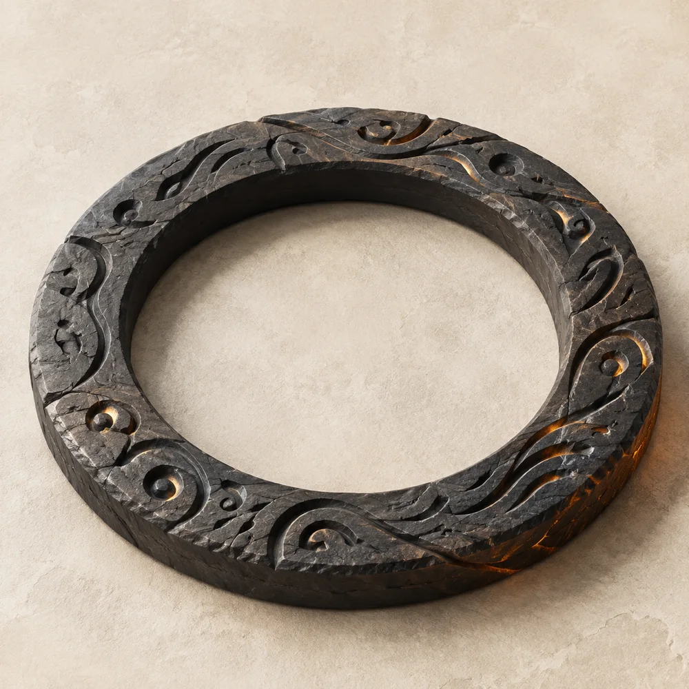
Dark stone and orange light are a familiar fantasy pairing because each strengthens the other. Rough, low-reflectance surfaces make small highlights feel intense; a bright warm edge reveals chips and grooves that would disappear under flat light. Convincing contrast depends on structure, not saturation alone.
Establish the material before the glow
Define the broad stone planes in neutral light first. Large chips need corresponding changes in silhouette or shadow, while shallow scratches should remain local surface marks. If every mark is equally deep and bright, the object loses scale.
A digital material can be inspired by basalt, sandstone or carved masonry without claiming to depict a particular geological sample. Use “dark stone-like surface” unless a real object and material analysis support a more exact name.
Choose one primary source
Place the strongest light where the visual story changes: behind the bird, inside a carved recess or along one edge. Surfaces facing that source should become warmer and brighter; surfaces turned away should remain quieter. This agreement makes an invented scene feel coherent.
Getty’s Radiant Darkness exhibition emphasizes that artists have long used represented light for different moods and meanings. For a contemporary fantasy study, the important lesson is formal: light directs attention. Any specific symbolic reading still depends on the work’s stated context.
Protect the dark range
Orange becomes more luminous beside a true dark, not beside another saturated orange. Preserve graphite and near-black areas around the focal point, then allow a few mid-tone copper transitions to describe form. Clipping every shadow to black removes the surface detail the light is meant to reveal.
The reverse is also true. A broad white flare erases feather edges and stone relief. Keep the brightest value small, and use softer reflected light to connect it to the surrounding material.
Translate the image onto a light page
A dark illustration can live comfortably inside a light journal when the page gives it breathing room. Neutral captions, generous margins and thin rules prevent the image palette from taking over navigation and article text.
Emblem & Fire uses ember color for links and small editorial markers, not as a full-screen background. The image carries atmosphere; the interface carries reading. This separation keeps long articles legible and makes the dark artwork feel intentional rather than continuous.
Working takeaway
Make stone, shadow and glow agree about one scene, then contain the drama inside the artwork so the page remains readable.
Sources and scope
These references support the historical and terminological framework. They do not endorse this publication or its illustrations.
- Getty MuseumRadiant Darkness: The Art of Nocturnal Light
Examples showing that represented fire and light carry different meanings in different works.
- National Gallery of ArtThe Elements of Art: Symbolism and Place
Introductory framework for distinguishing a visible form from the idea assigned to it.